
Lomochrome Purple 35mm Film Review & Photos From Japan
- csshop0
- 5 hours ago
- 3 min read

After growing up on film, and reengaging in my 30s, I've primarily shot on 35mm standard colour film, but with a recent trip to Japan for a month, I took a handful of film with me and vowed to try something a little bit out of my comfort zone...
Lomochrome Purple is the marmite of the film world, causing a dystopian backdrop by morphing greens and yellows, all whilst shifting other colours. Admittedly, it's not for everyone.
I put it to the test in Okinawa and Tokyo on my Dad's old Pentax Zoom 90, and I was pleasantly surprised by the results!
Lomochrome Purple 35mm Film Review & Photos From Japan
I shot a variety of subjects with this roll so I could get a feel for where this type of film excels.
Street photography, nature, a couple portraits and architecture. Lomochrome Purple is also readily available in both 35mm and 120 formats.
I must admit, having seen other sample shots from this film before, I still didn't really know how my photos would turn out, and I think that's part of the fun of trying a dystopian film stock like this, right?
Once my scans came back from the lab (all scan and dev by FilmProcessing.co.uk, of course!) it became clear almost immediately which photos excelled, and which ones I actually really loved.
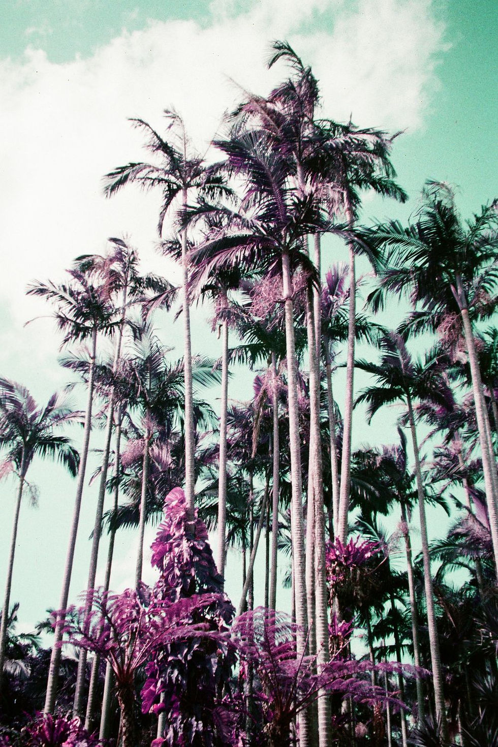
It's no surprise really that the photos in nature are what perform best with those greens transforming into out of this world purples.
You still get that lovely depth of colour with the purples though, almost mirroring the real greens, yellow and red nuances that were underneath during the height of autumn in Japan.
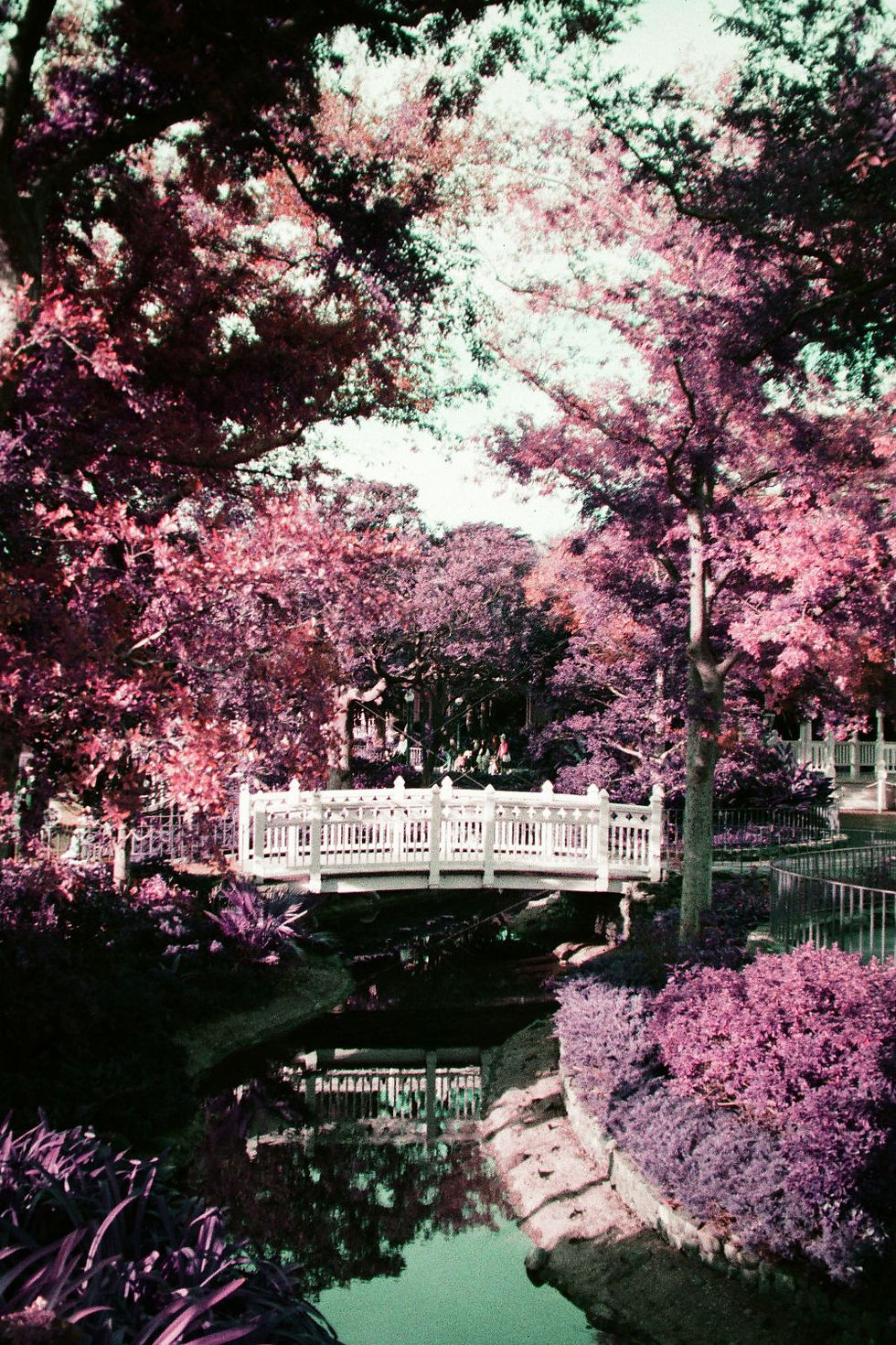
Can you believe this photo below was actually taken at Tokyo Disney?
Aside from the notable purple tones, you also get colour shifting coming from other bold colours in your shots.
The sky became almost turnquoise, with red elements appearing more orange in some cases.
But in fact, it differed across each of the settings, and of course, the daylight which was available at the time. This colour shifting element is part of the fun of this film stock.


What I also found interesting is how anything completely white, stayed just that! It really makes the rest of the colours in this scene at Tokyo Disney pop.
I really adore all of the outdoor day shots with this film stock, especially as all of the trees were looking at their best at this time of the year.

This is also one of my favourite shots, those red tones are intensified even more for a psychedelic look which is set against an almost turquoise looking backdrop for even more of a, not quite real look.

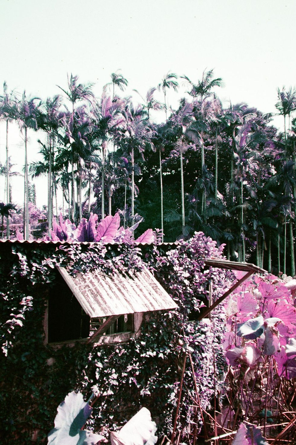
I really enjoyed my architectural shots, but only when there was some form of nature or trees with those tell tale green tones that transform into purple hues.
Without any of this I didn't find myself as interested in the shots, and where better to test it then at Akihabara, Tokyo!


Overall, I was definitely pleasantly surprised by shooting with this stock, and yes - I would use it again!
If you're considering using this film stock, I would recommend a focus on nature and architecture to get a true feel for how this film can really perform. I personally loved all of my images where there had been a lot of greenery/nature at the heart of them.
The colour shifting chaos can be unpredictable, and that's part of the fun. I truly didn't know what to expect when my scans came back. It's definitely a fun one to try if you're looking to try something new, and get creative with your photography.
Let me know in the comments below what you think of my results, and your thoughts on this unpredictable film stock!


Comments